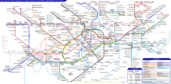
If you live in London, you’ve no doubt seen the new Tube Map. However, if you haven’t, the main changes are the addition of TFL rail (future Crossrail) and several new orange Overground lines.
While it’s wonderful that TFL are going to be running these new services, it does make the map increasingly difficult to read. That’s the reasoning behind Sameboat creating an alternative version of the new map (see above), which offers several advantages over TFL’s design.
The main advantage of course is colouring each of the Overground lines differently and giving them separate names. So instead of one spaghetti like orange Overground line, you have 7 lines which better reflect real service patterns.
They are:
- Watford Line
- West Cord Line (Current West & North London Lines)
- North Cord Line (Current Goblin Line)
- South Cord Line (Current East & South London Lines)
- Enfield Line
- Chingford Line
- Romford-Upminster Line
And in case you’re wondering, a chord line refers to: “A railway route across the outer parts of an urban area.”
While you may or may not be a fan of these names, we think they beat the current official names for some of the lines. E.g. the current official name for the East London line is: Overground Dalston/Highbury & Islington – West Croydon/Crystal Palace/New Cross Line
Additionally the map shows some permitted out-of-station interchnages not marked on the current Tube Map. E.g. Camden Town and Camden Road, Kentish Town and Kentish Town West, West Ruislip and Ickenham, Manor Park and Woodgrange Park and the whole area around Canary Wharf.
Third the map shows some of the additional new routes either currently under construction or in the planning stages. Most notable is the future Crossrail route across West London.
Fourth, The map adds in the Tramlink in South London, which has traditionally been left off the Standard Tube Map, although the stations are not included.
Finally, the map avoids the sharp angles of the current Tube Map design, and instead is much curvier. This makes the map slightly more geographically accurate, but for those unfamiliar with it, perhaps slightly more difficult to read.
What do you think of the design above? Something for TFL to consider or should they just stick with the tied and tested Harry Beck design? Leave your comments below:
Leave a Reply